I value seeing the downvotes and upvotes separately on posts and comments. Seeing a combined score doesn’t give an accurate picture of a submission. Lemmy s decision to separate these was a good one in my opinion. But Sync has combined them together again, like Reddit, which I dislike. I’ve checked all of the settings, but I don’t see an option to separate them back out again. Does anyone know if this is possible in Sync for Lemmy?
deleted by creator
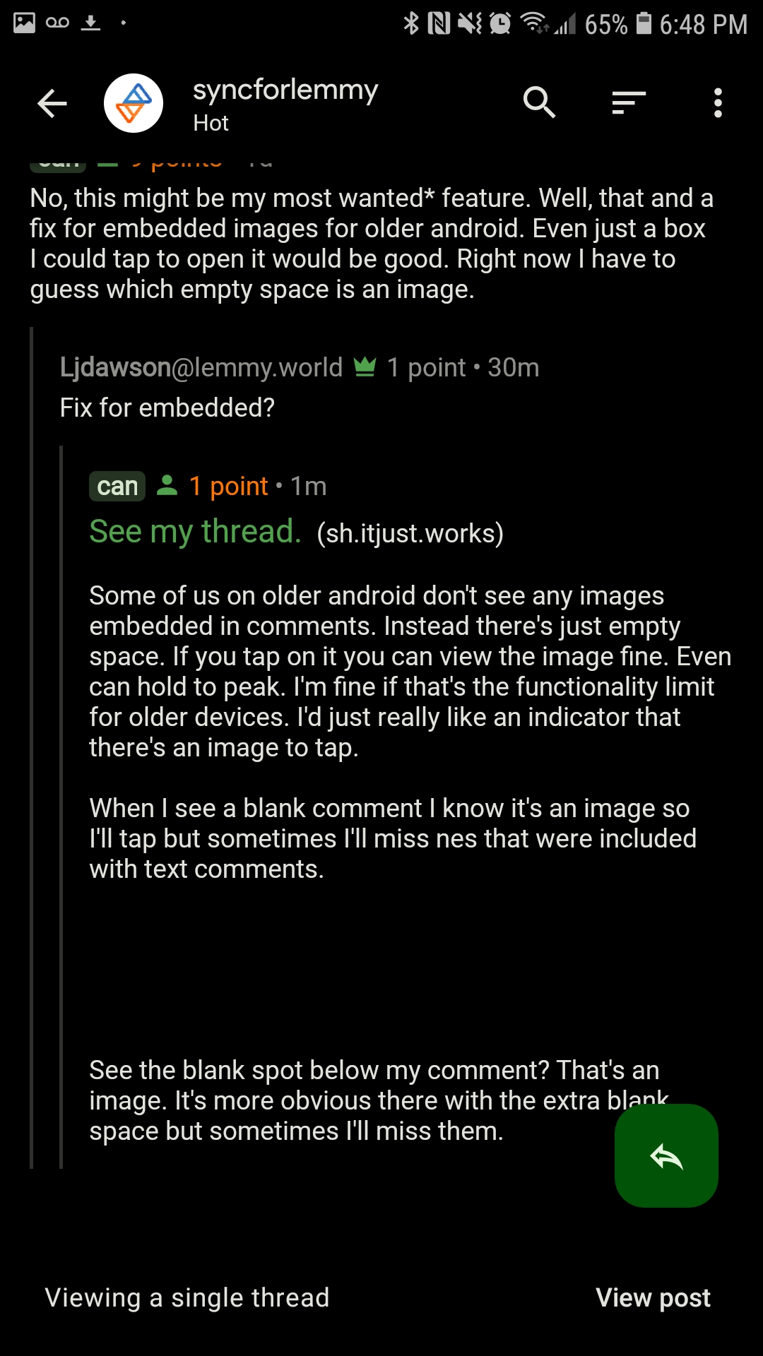
No, this might be my most wanted* feature. Well, that and a fix for embedded images for older android. Even just a box I could tap to open it would be good. Right now I have to guess which empty space is an image.
Fix for embedded?
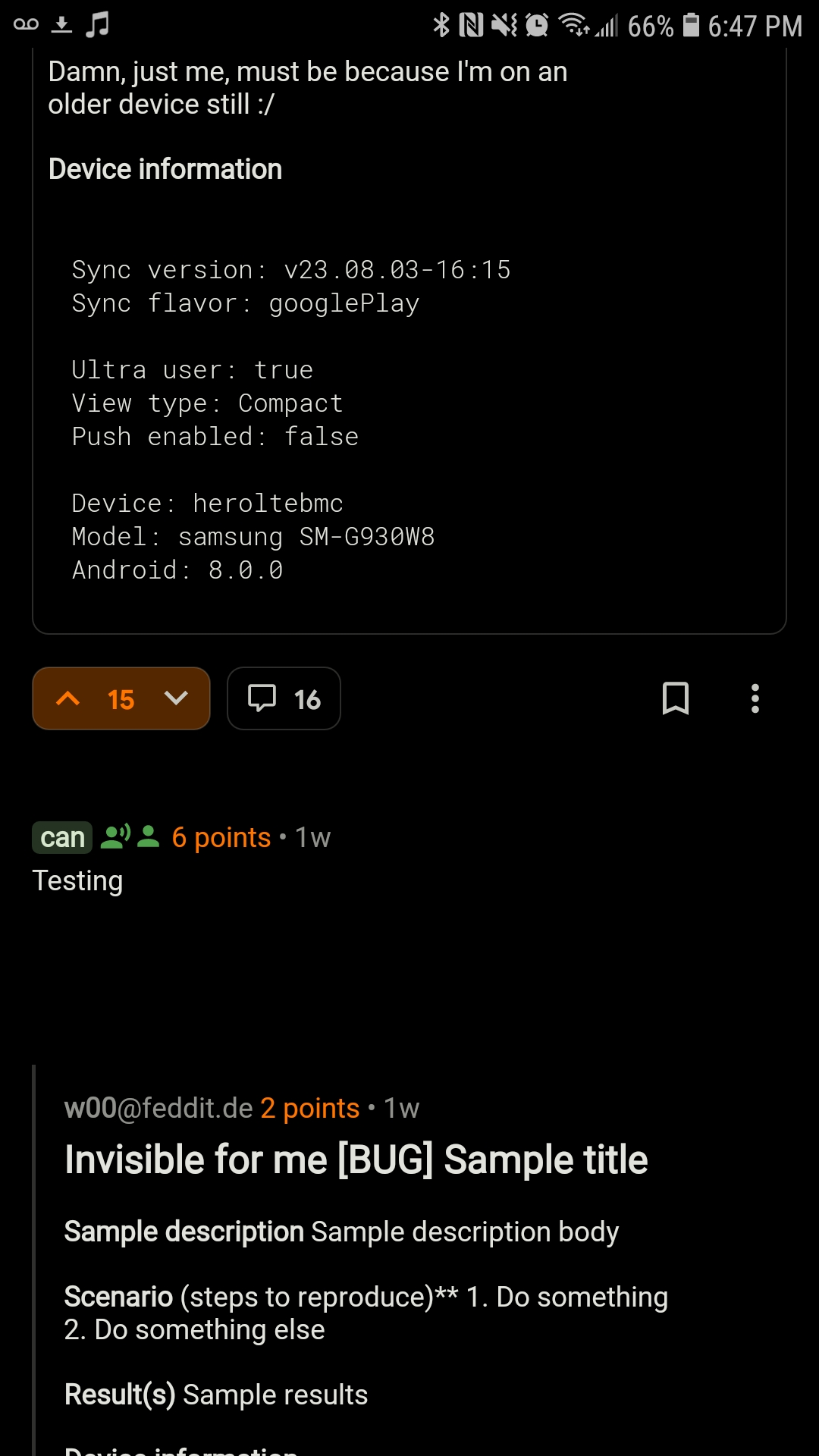
This is what my above comment looks like for me

Some of us on older android don’t see any images embedded in comments. Instead there’s just empty space. If you tap on it you can view the image fine. Even can hold to peak. I’m fine if that’s the functionality limit for older devices. I’d just really like an indicator that there’s an image to tap.
When I see a blank comment I know it’s an image so I’ll tap but sometimes I’ll miss ones that were included with text comments.

See the blank spot below my comment? That’s an image. It’s more obvious there with the extra blank space but sometimes I’ll miss them.


